About a year ago, I decided to switch from an iPhone to an Android phone. However, if I had known that a certain interaction in Spotify isn’t available on Android, I might have strongly reconsidered my decision back then — more so than the US banning the phone manufacturer a few months later.
On Spotify for iOS, I could easily swipe left on a song to add it to the queue which strongly suited my listening style. Imagine my frustration when I made repeated swiping attempts on my new phone but it just didn’t queue the song. My mental model of the interaction wasn’t realised. Instead, I found out that I had to do a few more taps to queue the song. This friction affected my experience with the app and I still resent the extra steps to this day (and it seems like I’m not the only one).
Mental model, in product design, is a set of expectations and belief that users have about how the product will function and behave which are based on their experience of using the product previously or of other products.
One of the challenges of designing a brand new product or redesigning an existing one is ensuring that the solution matches the user’s mental model as it plays a part in its usability, desirability, and user experience. There had been instances where a new design were unfamiliar to the users which had led to undesirable effects— beyond just adding a song to queue.

Fiat Chrysler recalls 1.1 million cars as new design of gear shifters confuses drivers
But does it mean that the design always has to match the user’s mental model exactly?
As models are creations of belief and experience, it can be reframed if the change is in lockstep or the user might already possess another model that’s based on their experience from other products. Recently, I was lucky enough to make use of the latter for a redesign work.
My colleague and I had to conceptualise and redesign a case management application used by career coaches. Career coaches do an exceptional job in helping job-seekers realise their career aspirations and improve their job readiness to secure quality jobs. However, they were let down by a buggy and outdated application that had several issues with usability and technical reliability.
After conducting several user interviews and contextual inquiries with the coaches and a support network of other officers, one of the main pain points they faced was tracking the progress of the jobseeker. There were multiple tabs sectioned according to the aspects of the case such as background, education, readiness, job search, and more. Coaches, support officers, and career matching partners would need to update accordingly into the tabs as they engaged with the jobseeker through various sessions. This makes it quite difficult to track the jobseeker’s progress clearly as the notes were written across different tabs by several people. And many had resorted to using their personal spreadsheets just to keep track of all their jobseekers.
So, we ideated on how we might improve case and performance tracking of jobseekers for the coaches. If we were to think of an existing product that allows us to be updated on various activities in a timeline, including being able to post and see posts by others too, you would easily think of any number of popular social media apps that already exists.
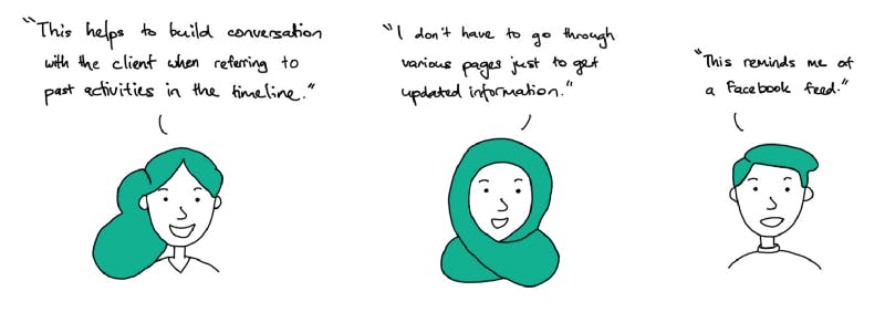
Subsequently, we prototyped a feed-like design where the user is able to record a note, tag it according to relevant topic(s), and post it on the jobseeker’s feed. We carried out several rounds of tests and iterations with the users and gave them tasks such as adding an engagement note and viewing notes related to a certain topic.
These were some of their responses:

Career coaches respond to the redesigned case management prototype
Most of the coaches were familiar with the design as they have a mental model from their experience using Facebook or similar social media apps. According to Jakob’s Law, one of the laws of UX, users spend most of their time on other sites, so they would prefer your site to work the same way as all the other sites they already know. The learning process for users can be simplified by providing familiar design patterns.
But beyond solving to improve the usability in recording engagement notes and keeping track of the jobseeker’s progress, we challenged ourselves to think of how to further assist the coaches with the redesign.
Another pain point that the coaches face was the heavy use of their time to search and recommend relevant jobs for the jobseeker as there was a separate job portal to access, as well as transference of information between systems and the jobseeker. As this is time taken away from providing more valuable service to the jobseeker, we decided to think of a new design that could address this.
Using an in-built assessment report with profiling of the jobseeker and the engagement notes being added progressively, the captured data points would then be used by the system to suggest relevant jobs that are suited for the jobseeker and pulled from the job portal. By cutting down on these manual tasks, the coach’s time can be better spent towards providing more valued and targeted counselling for the jobseeker.
Not only did we reframe the users’ mental model of how they can interact with the application, we also highlighted the additional value it can bring to their work. Ultimately, as product and UX designers, we should always strive to design beyond making a product more usable and user-friendly, and ensuring that it also brings added and significant value to their experience. To achieve this, reframing of mental models paired with user research and testing is key.
Here are some interesting reads on mental models in design:

